Hello everyone!
Before anything else, I want to thank the supportive comments from some users after I published the statistic in the previous newsletter that 88% of users consider that FacileThings has not completely solved their problem. A deeper review of the responses indicates that 1 in 5 admit they lack the discipline or motivation, and do not mention any real application issues.
In any case, this is not entirely negative. Understanding the obstacles you encounter when using FacileThings is the fuel that drives us to improve and innovate.
Another topic I want to return to is the discussion about the idea of changing the app’s colors. Making the app as accessible as possible for people with some type of visual impairment (basically, anyone over 40) is something we cannot give up on, so we’ve decided to release three color themes so each user can choose the one they find most comfortable:
- Light Mode, with a palette of blues and grays (and some green), following accessibility standards. For working with rested eyes.
- Dark Mode, also accessible. For people who are bothered by light or who work at night.
- Classic Mode, with the usual green palette, will not be 100% accessible. For those who prefer the traditional visual identity.
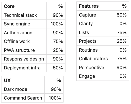
We continue to make progress every day in the development of the beta app. This is the current status of the project:

In recent weeks, we’ve been working primarily on the core aspects (deploying and configuring the app on the test server, and other technical issues).
We’ve also developed two text editors: one for entering task descriptions (with tools for tags, people, inline commands, and emojis) and another for entering task notes (with typical text editor options and compatible with Markdown). In this video, you can see both in action, using the Capture option in the mobile version (light mode):
As we move forward, we’re adding some new touches to the graphic design. While the design will be constantly modified during the beta phase, this is what the lists currently look like (light mode):
That’s all for now!


10 comments
Looking good! I especially like the idea of offering three colour themes which should cover the main use cases (accessible, dark mode and traditional).
The rest of the app is also looking much more modern. Great job.
Looking good! I especially like the idea of offering three colour themes which should cover the main use cases (accessible, dark mode and traditional).
The rest of the app is also looking much more modern. Great job.
Thanks for your feedback, JR! :)
Thanks for your feedback, JR! :)
I agree, looking great! Having the ability to more easily add Task Notes in the the Mobile app is very useful.
I am one of the users who haven't solved my problems with Facile Things, but not because the current app is lacking in any key way, just that it obviously depends on my entire workflow making sense and looking at my lists and so on, that is currently a bigger challenge for me. That said, everything you have mentioned on your plan sounds like a straight upgrade on classic FT so it is wonderful to see all the progress!
Thank you so much, Emil! :)
Thank you so much, Emil! :)
I'm extremely happy that the new mobile app is so fast. I'm mobile-centric person who doeas 90% of capture and engage while on mobile and it means a lot to me.
I'm extremely happy that the new mobile app is so fast. I'm mobile-centric person who doeas 90% of capture and engage while on mobile and it means a lot to me.
It's pretty fast ;)
Thanks, Michał!
It's pretty fast ;)
Thanks, Michał!
Keep up the great work! Enjoy seeing the work in progress.
Keep up the great work! Enjoy seeing the work in progress.
Thanks, Brandon! :)
Thanks, Brandon! :)
Regarding the new List view, I see that the tag values are still displayed in the task description. Will an effort be made to remove the tags from the description in the next iteration of the application?
For me, tags are meta information. Nice to have included with the task when clarifying, but not part of the description itself. I think it would be easier to read if my tag values were placed under the description, as with the Project and AOF information, and most certainly NOT in bold as it is today.
For example, the current approach and display are as follows:
Call Dad to discuss the upcoming birthday party menu #phone-call @dad
Project / AOF
Wherein the tag values for context and person are in bold, immediately calling attention to them rather than the actual action defined.
I would prefer the following:
- Call dad to discuss the upcoming birthday party menu
@dad / #phone-call / Project / AOF
Wherein the metadata below the description is smaller and lighter in color, allowing the eye to immediately gravitate towards the action and not its metadata.
Visibly, much cleaner. Much easier to read. Much easier to scan. The metadata can and should still be there, but provided as subtext.
Further improvement to the above would be to provide the user with the option to display or hide this information in the list view. I've already defined my next action. Why do I need to see the metadata again and again and again?
Of course, this is the List view, where such data being displayed might be very useful. But for the Engage view? Doubtful. The metadata would be a visual distraction.
I want to see the work I need to do. How I defined it should not be the center of attention.
Hi Cyrus,
Yes, we do have plans to provide more compact list views (without all the information) and allow the user to choose which views they prefer to use at any given time (with more or less data).
Regarding the tags, we don't have any plans to change them at the moment, but we will implement a public feedback system where improvements can be suggested and voted on. If an improvement receives enough support, it will be implemented.
In any case, we're currently focused on developing the new application. Once the new application is up and running, we'll look into these kinds of improvements.
Thank you very much for your suggestions.