

After a year of work, we are pleased to present the new FacileThings corporate identity and website. The aim of the project was to adapt the entire design to the brand personality and improve the user’s experience from different perspectives.
We live in a chaotic and frenetic world that surrounds everything we do, affecting how we do it and sometimes distorting why we do it. This is why FacileThings hopes to provide a space in which you can be calm and therefore focus on doing what you really want to do, easily.
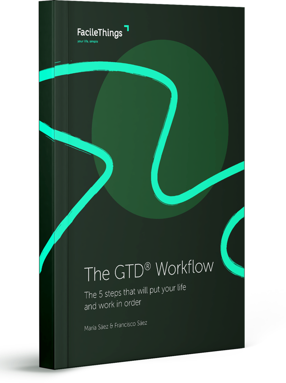
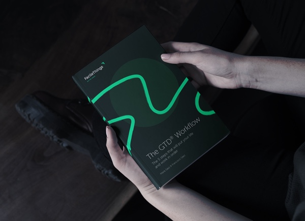
New corporate identity
FacileThings was born and evolves with the mission of building an effective organization software, strictly compliant with the GTD methodology and its vision: Good personal organization can turn chaos and stress into peace of mind, thus improving people’s quality of life.
As a consequence, the new corporate identity has been designed to provide a simpler and more serene work and management space, where colors and natural textures help creating a lighter and less intrusive visual dynamics.

The combination of deep green and wood, transports us to a quiet space in which we can address all issues with calm. The vibrant green, as a turning point, brings a touch of dynamism and energy that project the necessary motivation to start any task.
New web site
The main purpose of the web redesign has been to project the brand personality in a functional and intuitive space. A practical and simple website where clarity prevails over everything.

The new set of fonts, designed for online use, improves readability and makes reading a more peaceful and relaxed experience. Plus, the site gets strengthened by a new, more clear and accessible structure, eliminating the superfluous and fostering productivity by keeping focus on what really matters.
The How it works section remains critical because FacileThings has a clear educational value. The Basics help understand how the GTD system works in five easy steps. The Advanced Tutorials provide all the information needed to take full advantage of the FacileThings features. Thus, this section allows users to approach the GTD methodology, gradually and without stress, even if they haven’t heard of it before.
New web application
So far, the web application has only been adapted to the new corporate items, such as colors and fonts. However, a project of a new design intended to improve the user experience has already been launched, based on the FacileThings brand values, so you can keep getting things done, easily.

12 comments
Beautiful redesign. The black, green, and white is a little 'The Matrix' (movie) and I like it. However, I think you should shade the green tint less 'spring' and more 'lime' (Check Template:Shades_of_green on Wikipedia). Orange red against black would look as beautiful too (Check Template:Shades_of_orange on Wikipedia).
Beautiful redesign. The black, green, and white is a little 'The Matrix' (movie) and I like it. However, I think you should shade the green tint less 'spring' and more 'lime' (Check Template:Shades_of_green on Wikipedia). Orange red against black would look as beautiful too (Check Template:Shades_of_orange on Wikipedia).
Overall, I like the new design. There is a more relax vibe to it. The font used is cleaner too. The only drawback I have noticed is that on my laptop screen, the dark green is kind of washed out and not as differentiated from the grey than the former orange used to. For example, on the Calendar view, tasks to be done today have their date colored in dark green, and anything in the future is grey. On my laptop screen, the dark green of that day's tasks almost comes out as some dark greenish-grey and is not as contrasted from the grey of future tasks. However, my deskptop monitor is fine, the dark green is vibrant and separated from the grey. I know, I know, my laptop screen is cheap :) but still, something to watch for.
Overall, I like the new design. There is a more relax vibe to it. The font used is cleaner too. The only drawback I have noticed is that on my laptop screen, the dark green is kind of washed out and not as differentiated from the grey than the former orange used to. For example, on the Calendar view, tasks to be done today have their date colored in dark green, and anything in the future is grey. On my laptop screen, the dark green of that day's tasks almost comes out as some dark greenish-grey and is not as contrasted from the grey of future tasks. However, my deskptop monitor is fine, the dark green is vibrant and separated from the grey. I know, I know, my laptop screen is cheap :) but still, something to watch for.
Hi Ugo,
We have realized that Google Chrome on Mac doesn't render that green as it should (it doesn't happen with any other browser, even with Chrome on Windows.)
We're trying to find a fix for that.
Hi Ugo,
We have realized that Google Chrome on Mac doesn't render that green as it should (it doesn't happen with any other browser, even with Chrome on Windows.)
We're trying to find a fix for that.
Hi there, it seems that the app on appstore doesn't have the new design ? Do you know when it will get the new one ? Very best, eric
Hi there, it seems that the app on appstore doesn't have the new design ? Do you know when it will get the new one ? Very best, eric
Hi Eric,
The next release of the mobile app will have the new design. Give a couple of weeks ;)
Hi Eric,
The next release of the mobile app will have the new design. Give a couple of weeks ;)
I also like the redesign, but I agree with Tiago about the shade of green. It's too strong for me to feel comfortable looking at in the long-run.
I also like the redesign, but I agree with Tiago about the shade of green. It's too strong for me to feel comfortable looking at in the long-run.
Looking good! I like the redesign. Would be great if the task text would be stand out a little more from the rest of the text. Could you elaborate a little on what we can expect regarding the planned updates in functionality?
Looking good! I like the redesign. Would be great if the task text would be stand out a little more from the rest of the text. Could you elaborate a little on what we can expect regarding the planned updates in functionality?
Why not use the Evernote and Internet icon instead of the text 'Open the note in the Evernote app or in its website'? That would make it even more clean.
Why not use the Evernote and Internet icon instead of the text 'Open the note in the Evernote app or in its website'? That would make it even more clean.
Thank you very much Francisco.
Thank you very much Francisco.
Hi guys,
Actually, the web application haven't been "redesigned" yet. We've just (quickly) adjusted it to the new corporate brand.
The very first goal is to get people used to it, without further changes. From now on, we'll be redesigning all the sections of the app, one by one. Things like font sizes, icons, data distribution, etc., will be completely revised by our design team.
Thanks for your feedback!
You should also check out how Zendone handle Evernote notes. Hovering over the Evernote icon displays a small version of the note. This makes it easy to check out the note without leaving the application.
You should also check out how Zendone handle Evernote notes. Hovering over the Evernote icon displays a small version of the note. This makes it easy to check out the note without leaving the application.
Hi Mike,
We'll allow to see the notes in the tasks more easily, soon. Not very fan of the "hovering" style though (kind of intrusive and annoying when you move the mouse without the intention of seeing anything.)
Hi Mike,
We'll allow to see the notes in the tasks more easily, soon. Not very fan of the "hovering" style though (kind of intrusive and annoying when you move the mouse without the intention of seeing anything.)