
Hello everyone!
I hope you had a great summer, enjoyed your vacation, and are returning full of energy.
We’re fully dedicated to developing the new beta app, while also analyzing your survey responses to decide how we should improve the app first.
The first major conclusion of the survey is that most users come to FacileThings specifically looking for a suitable tool to implement GTD. They want an application that faithfully follows GTD principles without having to build their own system from scratch. This means that our positioning as a dedicated GTD application meets a real market need (something that in my mind is sometimes not so obvious).
However, only 8% of users believe FacileThings fully solves their problem, while 88% consider it a partial solution, and 4% did not answer the question. Therefore, the second major conclusion is that we have a lot of room for improvement.
This is actually something I’ve been sensing for a while and the reason we’re developing a new app from scratch. While FacileThings provides a solid GTD foundation that users appreciate, there are systematic barriers in the current app that prevent many users from achieving a comprehensive solution.
The three most frequently mentioned improvement groups in response to the question, What would you need from FacileThings to achieve a complete solution? could be described as follows:
- User interface and design improvements (30%). Modern design, dark mode, better visual appeal, more intuitive interface, etc.
- Mobile app improvements (28%). Better mobile experience, app enhancements, mobile-specific features, etc.
- Task and project management features (22%). Better project overview and organization, improved filtering and search capabilities, clearer next action management, etc.
The answers are somewhat generic since this is a generic survey, but we’re going to create a platform where everyone can comment, debate, and vote on specific improvements you feel are important. This will allow us to move the beta app in the right direction.
Speaking of the new beta app, we’re currently developing the app’s most important features, namely those related to list management and task editing. Once this part is finished, we’ll be close to releasing the version.
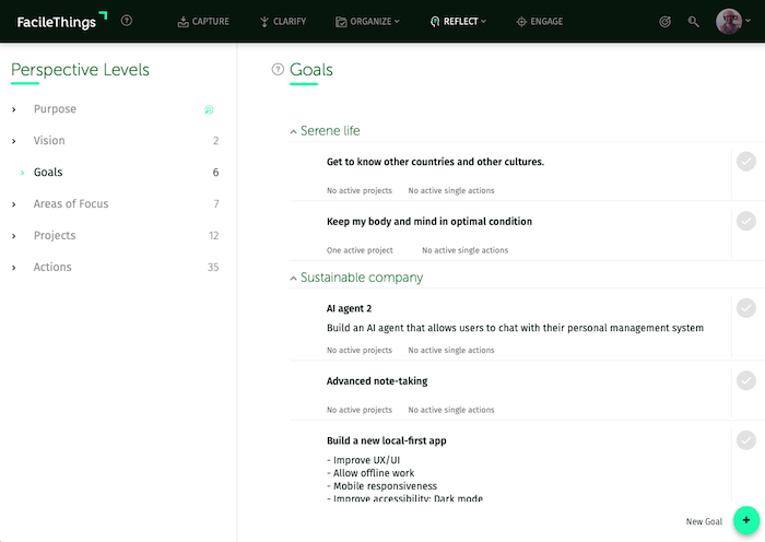
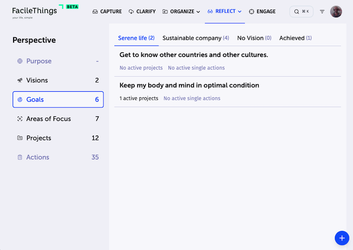
Although graphic design isn’t paramount at this stage, we do want to improve some general aspects that affect accessibility, such as font size, color contrast, and the amount of information displayed at once.
To achieve better contrasts and increase the readability of the information, we’re also considering switching from “green” to “blue.” What do you think? ☺️ On the blog, screenshots appear 30% smaller, but I’m including two representative images in equal conditions so you can better compare:
That’s all for now!


19 comments
Hello Francisco,
Welcome back after the holidays (you took time to rest, I hope).
Regarding the user interface, I like the screenshot but seems like it will be too much blue in a big screen and looking at it for several hours (like doing the weekly review). Afraid it can be a bit tiring after a while.
But yes, the green is a bit aggressive and can be muted down a bit.
Mobile app, I think the new beta allowing the resizing will solve a lot of these issues. I would love to share things from apps from my phone to facilethings using the share sheet.
Task and project management features - I still get a bit strange when I have a project and concurrent actions, and I have to switch to kanban to get two actions in a project as on-going. If I could just remove the predecessor and still have the same thing, would be great.
All in all, I think you have a great ideia for ongoing and can't wait to see where it goes.
My still only blocker at the moment is using facilethings with the amount of email that I have, but that says more about my method than the app.
I’m really looking forward to seeing how it turns out. But I find it a pity to completely abandon FacileThings’ visual identity. This design has been part of the software’s identity for years now. That green on a black background is part of it. Of course, it can be revisited, adjusted, modernized… but not to the point of going in a completely different direction.
I would almost feel like I’m switching to a different piece of software… and that would be a shame.
Agree with Marc: )
Agree with Marc: )
I like the current black and green color scheme (but it is not a deal breaker for me). I do run in dark mode most of the time for battery savings on my phone and tablet :)
A few this from my wish list:
* Full text search - The search function now appears to only search in the task description (not the notes portion). Searching in the notes would be a big help (I put help desk ticket information into some of my notes. It would be great to search for those numbers as well as many other things).
* Sharing target on the mobile app - the ability to pick the FT mobile app as a sharing target on my phone and tablet (I use Android) would help. I have to cut links etc. and then open the app to share them now
* Hot-key quick task entry on PC/MAC etc. would be a benefit instead of needing to switch to the app
* Location based reminders on the mobile app would help for errand items
* Quality of life idea - would it be possible to have a feature (could be turned on and off if users do not like it) that would set the task as depending on a predecessor by dragging and dropping it on the task you want it to depend on?
Those are a few things off the top of my head.
I love FT and am looking forward to seeing where you are taking it. Although I have an internet connection most of the time, the offline ability will be nice.
Scott
I actually really liked the old design and like the new suggestion even more. So whatever you decide, I think it's going to look very nice. I agree, tuning down the high contrasting stuff is a good idea and feels nice, productive and modern.
I actually really liked the old design and like the new suggestion even more. So whatever you decide, I think it's going to look very nice. I agree, tuning down the high contrasting stuff is a good idea and feels nice, productive and modern.
Hi folks,
I really appreciate your feedback.
The reality is that the current color palette is quite tiring for some users, especially those of a certain age. We've received quite a few complaints about this. It's not about the colors themselves, but rather about the combination, contrast, and font size.
The problem with the color palette we're currently using is that the brightness and contrast of the chosen shades aren't very good for readability. This doesn't mean we should eliminate green, but at the very least, we'll have to change the shades if we want the app to be visually comfortable for most users. The reason we're considering using blues is that they affect people with some kind of visual impairment much less and achieve better contrast with light backgrounds.
I'm the first one who doesn't want to abandon FacileThings' visual identity, but at the same time, I want it to be accessible to most people. This is also the reason why there will be a dark mode. It's not because it's a trend, but because there are people whose eyesight really suffers from the brightness of the screen in light mode.
In any case, we're currently testing, and the changes will come gradually. I also think you'll have a more solid opinion when you have a chance to use the beta app for a few days.
Regarding other topics you've mentioned: We'll be rolling out hotkeys in the beta. Full-text search is also planned for after the beta. Sharing with the mobile app will come in a second phase, when we implement native phone capabilities in the app.
Thank you!
IMHO - going to blue or even Navy could be good direction, but I agree with Alexandre that proposed screen-shot is too much blue - I would like to see it on white background :)
IMHO - going to blue or even Navy could be good direction, but I agree with Alexandre that proposed screen-shot is too much blue - I would like to see it on white background :)
Thanks for your feedback, Wojciech. Probably you'll see several combinations during the beta phase ;)
Thanks for your feedback, Wojciech. Probably you'll see several combinations during the beta phase ;)
I'd really like to be able to do a Weekly Review in the mobile app. For me, doing this review more frequently would improve my productivity and I have a lot of dead time when at a sports tournament for my kids or am commuting on public transit.
I'd really like to be able to do a Weekly Review in the mobile app. For me, doing this review more frequently would improve my productivity and I have a lot of dead time when at a sports tournament for my kids or am commuting on public transit.
Hi Dan,
The new app will allow all features to be used on mobile devices, including the Weekly Review ;)
Hi Dan,
The new app will allow all features to be used on mobile devices, including the Weekly Review ;)
The main thing I miss with this product is a good calender experience. I have divided up my routines into 15 min chunks and use checklist to stay on track. I need to see these 15 min slots on the calender clearly and have them on the go easy to click into and check of as I go through my day. I love everything else in this product but I keep moving back and forth between Ticktick that has a great calender and checklist setup on the go and on computer and this product that has everything else. I would love if the calender experience could get some focus and get improved. / Sofia
The main thing I miss with this product is a good calender experience. I have divided up my routines into 15 min chunks and use checklist to stay on track. I need to see these 15 min slots on the calender clearly and have them on the go easy to click into and check of as I go through my day. I love everything else in this product but I keep moving back and forth between Ticktick that has a great calender and checklist setup on the go and on computer and this product that has everything else. I would love if the calender experience could get some focus and get improved. / Sofia
Hi Sofia,
Sure, the calendar experience is essential to our app. Once we have the beta app up and running, we'll be ready to improve all of these things that cause friction in your experience. The calendar component will be completely new. I'll take note of the 15-minute slots ;)
Thanks for your feedback!
Is the all data e2e encrypted in the database?
Is the all data e2e encrypted in the database?
I agree with Marc.
I agree with Marc.
Hi John,
Currently, the database is not encrypted because we prioritized response speed (decrypting data with each interaction increases response time). However, it's likely that when the new beta app we're developing goes into production, response time won't be as critical, and we'll decide to encrypt the data.
Thanks for your interest!
Always a pleasure read your news!
The color is not a deal breaker for me, but I concur with Marc: the current color scheme is iconic, when I think about FT I see that green and black scheme.
I've an idea: make the be app "themeable" and make everybody happy (except the developers 😅)!
Always a pleasure read your news!
The color is not a deal breaker for me, but I concur with Marc: the current color scheme is iconic, when I think about FT I see that green and black scheme.
I've an idea: make the be app "themeable" and make everybody happy (except the developers 😅)!
Hi Paolo,
You nailed it! Yeah, that's probably what we'll do. Let everyone choose how they want to view the UI.
Thanks for your support! :)
Hi Paolo,
You nailed it! Yeah, that's probably what we'll do. Let everyone choose how they want to view the UI.
Thanks for your support! :)
I prefer the black and green and white background, it feels like it's your "Identity", when I see those color combo, I think of FascileThings. But colors are not really the deal breaker, its the contrast ratio and font sizes for me. I'm a person with a slight vision disability. If you follow the WCAG standards, you'll be fine.
Making it themable is good option, but you should include at least a few themes designed with vision clarity in mind.
I'm glad to hear your voice in this discussion because that's really the point I wanted to address: making the system more accessible to people with some kind of visual impairment (which these days means almost anyone over 40).
I want the main theme to meet all visual accessibility standards. There will also be a "classic" theme for those with good vision who don't want to change.
Thank you very much for your contribution!