Developing the new Dashboard has taken us longer than we had anticipated because we have been very concerned about taking care of all the details related to the usability of this tool, but I think the result has been worth it. Well, a picture is worth a thousand words:

This new section of FacileThings has several objectives:
- Help you do the Daily Review. Here you will only see the actions to be performed in the very short term. What do you need to do today? First look at the today’s Calendar. There you must have the mandatory actions and events for the day. In the free moments, look your Next Actions and filter what actions you could be doing at the moment, according to the context in which you are and to your available time and energy.
- Help you choose the next action. The fifth and final stage of the GTD workflow is Do (now called Engage). This tool allows you to choose the next action to do based on the GTD’s four-criteria model.
- Help you maintain good productive habits. We will show you reminders to do the Weekly Review or process your inbox when needed, and instructions to keep your system up to date.
- Help you align your day to day with higher values. For your daily actions to be meaningful, they must be related to what is important to you. We have introduced information that will help you realize whether that alignment exists or not.
- Introduce you new design elements. This is the first screen that incorporates the new design of FacileThings. Many of the design ideas presented here will be extended to the rest of the application, so your feedback about it will be important ;)
Your Daily Review, at a glance

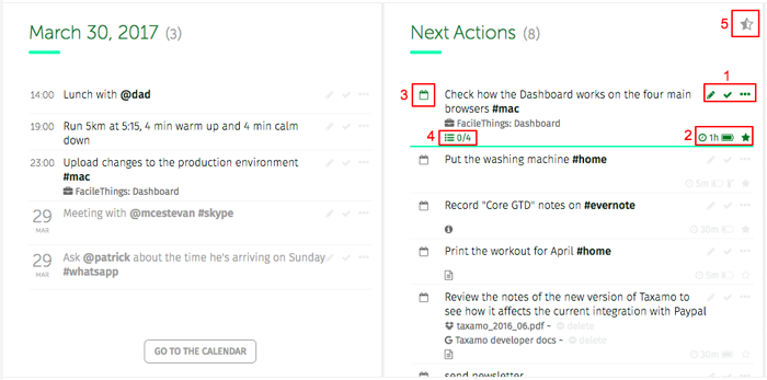
The left panel shows you the actions of your Calendar for today while the one on the right shows you the complete list of Next Actions.
At the end of the today’s Calendar you will also see the actions and events that are pending from previous days. If they are finished, mark them as “done”. If not, you should modify their date or, better, consider removing the date so that they become “next actions”.
You can organize the actions in these panels just as if you were in the Lists section. When mousing over an action, all possible options will be activated: (1) Edit, do, and a menu with the other organizational options, (2) focus and assign the estimated time and required energy, (3) assign a date, and (4) view additional information like notes, check points, attached files, etc. You can also filter only the actions on which you have decided to focus these days (5).
Choose the next action
By clicking on “What to do now?” the tool to select the next action will show up:

You will see a list with all the contexts available in your Next Actions list (tags and people). Select the one you are interested in at this time and add available time and energy criteria if necessary. Actions filtering is immediate.
You will not overlook anything
The Reminders Panel on the right of the actions lists will show you information that may be relevant to your daily activity:
- If you have not done the Weekly Review for too long.
- If you have several stuff in the Inbox and you have not processed it for some time.
- If you have notifications you have not seen yet.
- If there are projects or goals with due dates nearby.
- If you have delegated actions with due dates nearby.
- If you have incubated stuff you need to be reminded.
Work with perspective
The chart about Areas of Responsibility shows you how you are spending your time and helps you realize which aspects of your life are not being addressed satisfactorily.
And keeping in mind what your life purpose is can be very motivating to face your daily work.


17 comments
Cool, I like it. It instantaneously provided benefit for me! Thanks a lot, Günther.
Cool, I like it. It instantaneously provided benefit for me! Thanks a lot, Günther.
I like this tool as well! I am finding it particularly helpful in addressing "incubating" items, which would sometimes fall off my radar screen.
One thing, though: the current date does not appear correctly. For me, it appears one day ahead of what it should be. Anyone else experiencing this?
I like this tool as well! I am finding it particularly helpful in addressing "incubating" items, which would sometimes fall off my radar screen.
One thing, though: the current date does not appear correctly. For me, it appears one day ahead of what it should be. Anyone else experiencing this?
This is an excellent first step in truly empowering the user to see the "big picture" and make the best decisions. I see areas of improvement, but I am very pleased with its initial design and layout. I think the FT team did a great job of identifying the most important information that will help me take actionable and meaningful steps during my day. The new dashboard compliments the application and provides the user with the information they need to be successful.
Well done!
Thank you, guys!
PS: Joseph, the current date issue has been already fixed.
Thank you, guys!
PS: Joseph, the current date issue has been already fixed.
I am experiencing the one day ahead of schedule issue too: although it is March 31 now (at least in my timezone - New York), the date shown is April 1st. But otherwise, I'm quite happy with the dashboard for now.
I am experiencing the one day ahead of schedule issue too: although it is March 31 now (at least in my timezone - New York), the date shown is April 1st. But otherwise, I'm quite happy with the dashboard for now.
Hi Ugo,
Just refresh the page! ;)
Hi Ugo,
Just refresh the page! ;)
Thanks, Francisco for the quick fix on the date issue. The more I utilize the dashboard, the more I realize how powerful of a GTD tool you have added to FacileThings.
Thanks, Francisco for the quick fix on the date issue. The more I utilize the dashboard, the more I realize how powerful of a GTD tool you have added to FacileThings.
Thanks for the exciting update! Looking forward to playing around with it. Is there going to be a way to sort the contexts in the What to do next pane? I'd like to have the most used at the top please...
Thanks for the exciting update! Looking forward to playing around with it. Is there going to be a way to sort the contexts in the What to do next pane? I'd like to have the most used at the top please...
Hi Steve,
Thanks! We really think that ordering the contexts alphabetically is the best way to easily locate them.
Hi Steve,
Thanks! We really think that ordering the contexts alphabetically is the best way to easily locate them.
Agree with Gunther, this provided me immediate benefits! Excellent improvement!
Agree with Gunther, this provided me immediate benefits! Excellent improvement!
Now, after having worked with the new Dashboard for a while, I still think that it is a great improvement of the user experience. Still, I think it would be even better if there was the possibility to set the focus for next actions, just like it is possible in "Lists".
And when talking about setting focus: It should be possible to select more than one icon. Why? Setting the focus regularly is an iterative process. In the first step I might only know which focus elements to exclude and only then, based on the results, may be in the position to make a qualified decision.
Hi Günther,
Actually you can set the "focus" option in the Next Actions list. Just click on the star-shaped icon at the top-right of the list ;)
Hi Günther,
Actually you can set the "focus" option in the Next Actions list. Just click on the star-shaped icon at the top-right of the list ;)
Hi Francisco,
thanks for your reply! I fear I didn't phrase it sufficiently good: What I mean is the "Focus on" filter on "Area of Responsibility" or "Goal". I miss this on the dashboard and "icon" above of course meant "item", sorry :-).
Cheers
Günther
Hi Francisco,
thanks for your reply! I fear I didn't phrase it sufficiently good: What I mean is the "Focus on" filter on "Area of Responsibility" or "Goal". I miss this on the dashboard and "icon" above of course meant "item", sorry :-).
Cheers
Günther
Sorry for the misunderstanding, Günther. The ARs/goals filter will be located in the navigation layout (options and menus area) of the new design. That's why you can't use it on the Dashboard yet. We will update the navigation layout as soon as possible.
Sorry for the misunderstanding, Günther. The ARs/goals filter will be located in the navigation layout (options and menus area) of the new design. That's why you can't use it on the Dashboard yet. We will update the navigation layout as soon as possible.
I was going to request something like this, but your version turned out even better!
I was going to request something like this, but your version turned out even better!
Thanks, Richard!
Thanks, Richard!
I believe this change - especially with engage/do - functionality is the most helpful feature for me. I seem to have a threshold of actions, that when collected, overwhelms me in the list view and I respond to it with resistance. This ability to see only what matters in the current context and area of my life is keeping my view narrow enough to start getting things done instead of just collected. Thank you.
I believe this change - especially with engage/do - functionality is the most helpful feature for me. I seem to have a threshold of actions, that when collected, overwhelms me in the list view and I respond to it with resistance. This ability to see only what matters in the current context and area of my life is keeping my view narrow enough to start getting things done instead of just collected. Thank you.